01/09/2024
Systematics Solution
Systematics Inc. provided high-quality custom fabrication and printing solutions, delivering expertly crafted POP displays that enhance brand visibility and engagement.
Automation
Web App
Company
Systematics Solution
Location
Itasca, IL, USA
Client
Andy Sanghani
Lead Product Designer & Developer
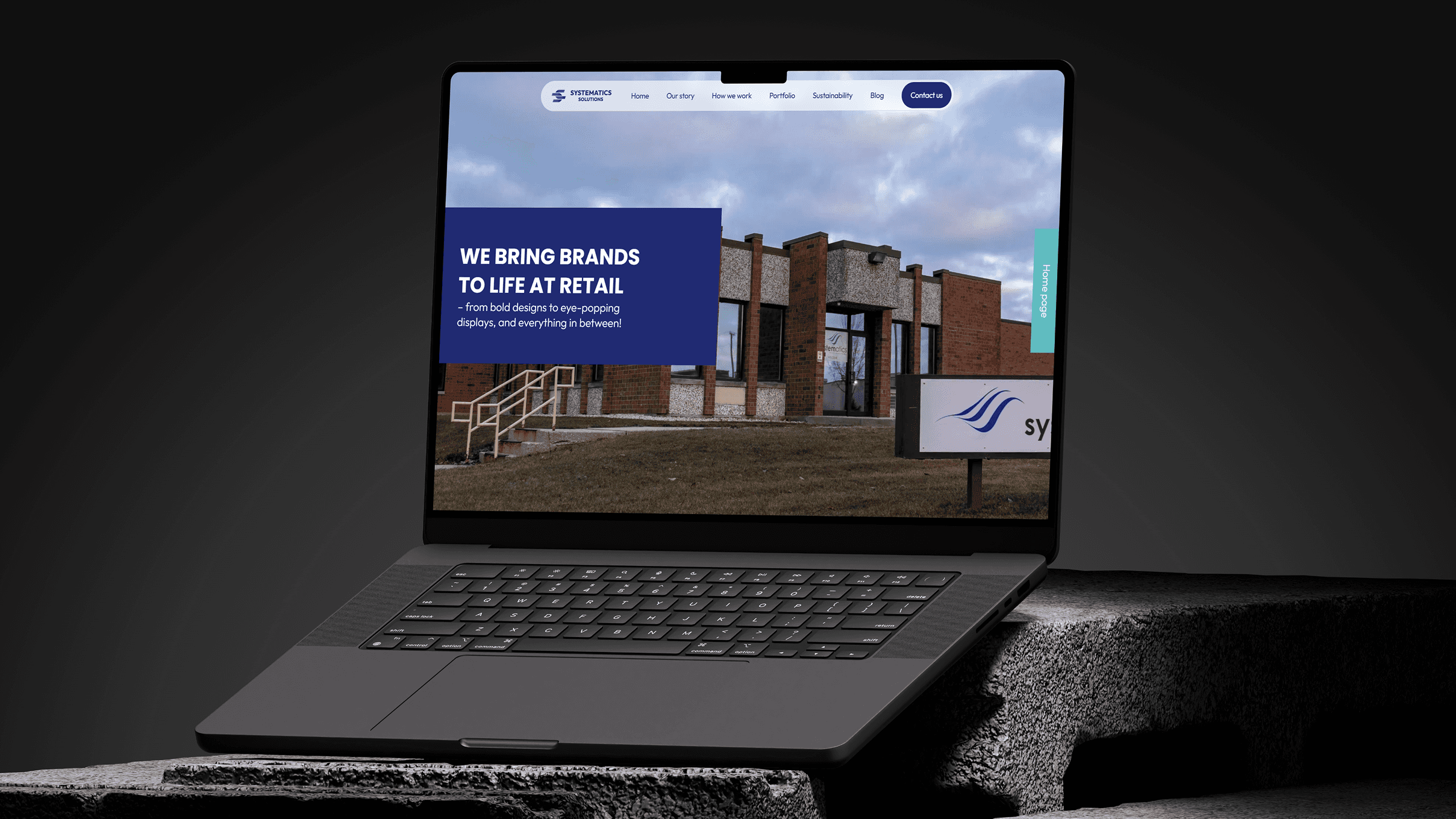
Systematics Solutions is a B2B company specializing in high-end packaging and branded displays. I created a fully responsive portfolio platform from scratch to showcase their work and generate leads.
From research and brand refresh to UX/UI design, testing, and development—I led the entire process, delivering a clean, intuitive experience that reflects their premium positioning and drives client engagement.
Services
Web Platform
Mobile Application
Product Design & Research
Feature Discovery
Category
Marketing
Social Media Campaigns
Timeframe
September 2024 - Present

The goal was to create a digital platform that mirrors Systematics’ premium packaging work while helping the sales team convert more leads. I began by interviewing the marketing and sales teams to understand how they communicate with clients, what questions they get most often, and what potential customers are looking for.
From there, the focus was on building a responsive, easy-to-navigate site that highlights their portfolio and allows visitors to quickly get in touch. The final result helped streamline their sales process and led to a 40% increase in inquiries, with a noticeable drop in bounce rates.
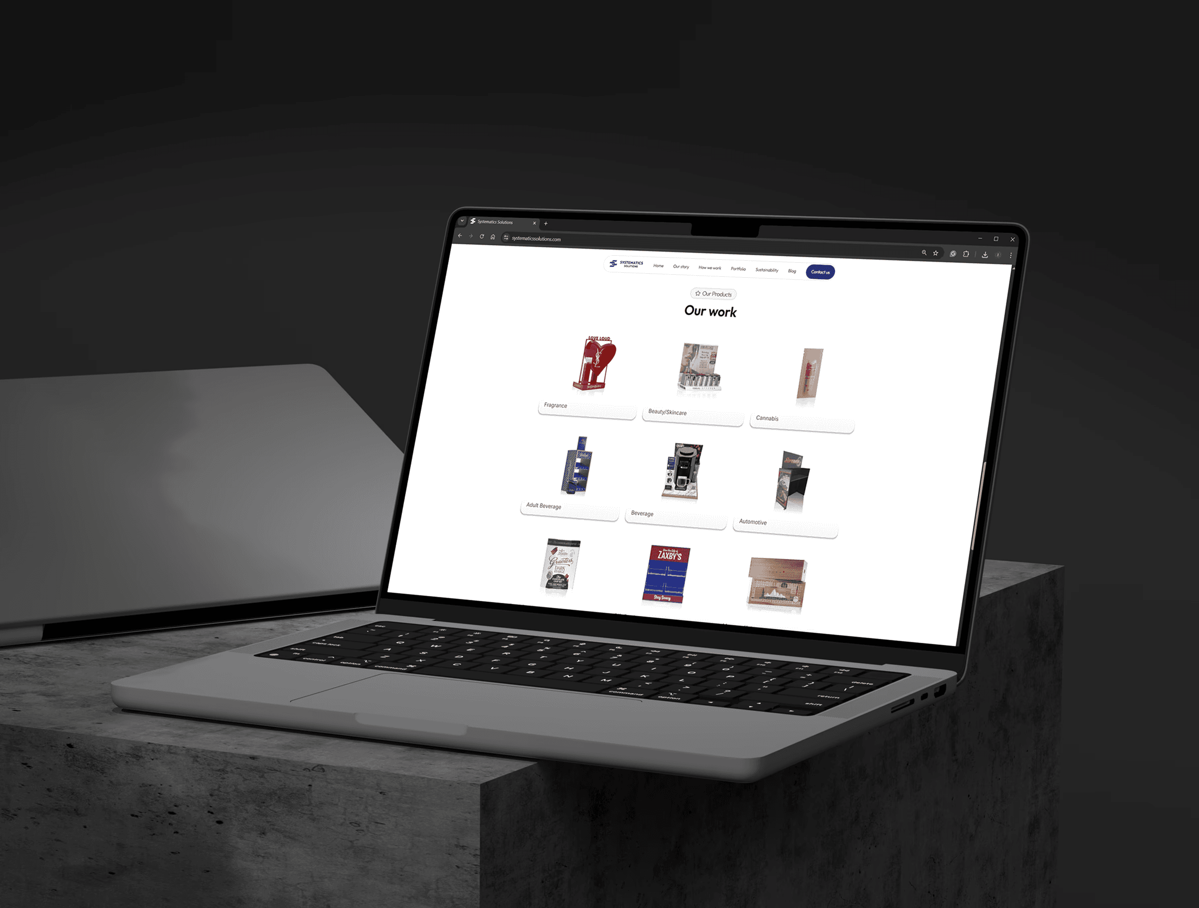

Systematics needed a digital platform that not only highlighted their high-quality products but also engaged potential clients. The goal was to create a site that showcased different product types, facilitated communication between customers and the sales team, and allowed for easy updates on upcoming projects. The challenge was to design a seamless, intuitive experience that would represent the brand effectively and increase lead generation.
I started by interviewing the marketing and sales teams to understand how they interact with clients, what questions are frequently asked, and what content would be most valuable. I also mapped out the key features: an interactive portfolio, product descriptions, an About Us section, a blog for project updates, and a contact hub for customer communication. This research guided both the site’s content structure and the user journey.
From there, I created design sketches and prototypes to visualize how users would navigate through the various sections and interact with the content. The design was focused on being visually appealing yet functional—showcasing products, providing company insights, and encouraging user interaction. After finalizing the UI/UX, I refreshed the brand identity to ensure consistency across the digital experience.
Once the designs were approved, I developed the website in Framer, ensuring it was fully responsive across all devices. Features like product displays, contact forms, and blog integration were built to encourage engagement and allow for ongoing communication with potential clients. Testing and feedback rounds followed before launching.
The core goal was to create a platform that not only looked professional but also made it easy for clients to explore Systematics’ diverse offerings. I focused on creating an intuitive user flow, with clear sections for each product type, as well as interactive elements that would keep the visitors engaged. The design needed to emphasize the craftsmanship of Systematics’ products while simplifying the process of connecting with the company.
I prioritized clarity in navigation and a visually engaging layout, ensuring that potential clients could quickly find what they were looking for—whether it was product information, company details, or project updates. The platform was also optimized for mobile, making sure the experience was seamless across devices.
The website was developed using Framer, which provided flexibility for rapid prototyping and efficient development. I ensured the platform was fully responsive, meaning it worked flawlessly on any screen size, from desktop to mobile. Framer’s powerful visual editor allowed me to focus on creating an interactive, user-friendly experience without sacrificing performance.
In terms of features, I integrated sections for showcasing different types of products, a blog for project updates, and easy-to-use forms for customer inquiries. The technical challenge was balancing all of these dynamic features while maintaining speed and usability, which was achieved through careful optimization and testing.