
Product Designer — Mobile App Design
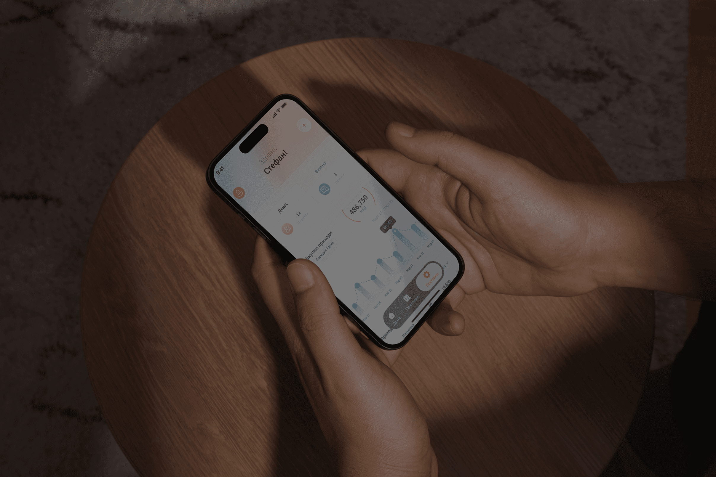
Med-X is a diagnostic imaging clinic where the schedule is the business. They had a web platform, but no way for doctors and staff to run that schedule from their phone.
I designed the mobile app: their existing brand, rebuilt for a small screen and a busy user. In Macedonian, for people who open it fifty times a day between patients.
Service
Mobile App Design
UX & IA
UI Design
Design System
Interaction Design
Category
B2B
Internal Tool
Timeframe
March, 2026 - July, 2026
( 00-01 )
THE PROBLEM
A doctor between scans doesn't want a database. They want a few things fast: who's next, for which scan, when, and whether the day is on track.
The brief was clear. Keep the web brand, but don't just make the site responsive. Build something a doctor can read in seconds, one hand, mid-shift.

( 00-02 )
A HOME SCREEN THAT LEADS WITH THE DAY
Most apps open with a menu. This one opens with an answer.
The top of the home screen carries the two things staff check most: how the clinic is doing (daily and weekly revenue), and what the day holds (today's appointments, grouped by service).
The real work was subtraction. Each appointment shows only what helps staff act: name, service, time, and contact. Everything else the system stores stays out of the way.

( 00-03 )
DESIGN SYSTEM
I was extending a brand, not inventing one.
I built every screen from one dashboard, sharing the same parts: nav pill, appointment cards, filter pills, revenue cards, form fields. Same colors and typeface as the web, rebuilt to feel native on mobile. Consistent with the site, never a copy of it.
( 00-04 )
NAVIGATION, CUT TO WHAT THEY ACTUALLY TAP
The brief asked for four tabs. One of them, "new appointment," is an action, not a place.
So I made it a single plus button and kept three real destinations: the day, the schedule, and settings. Three tabs, one obvious action, no thinking required.
( 00-05 )
DESIGN SYSTEM
I was extending a brand, not inventing one.
I built every screen from one dashboard, sharing the same parts: nav pill, appointment cards, filter pills, revenue cards, form fields. Same colors and typeface as the web, rebuilt to feel native on mobile. Consistent with the site, never a copy of it.
( 00-06 )
RESULTS
A design-stage deliverable, so this is what shipped:
Four full screens in Macedonian: Дома, Прегледи, Нов преглед, Поставки
A dashboard that leads with revenue and the day's appointments
A mobile design system extending the existing web brand
Navigation cut from four items to three tabs plus quick-add
( 00-07 )
DISCOVER MORE


